An Android app icon is not one image. It is a launcher icon at five densities, a round variant, an adaptive icon made of a separate foreground and background, and a 512×512 PNG for the Play Store listing — and each is judged at a size where a website logo's fine detail disappears. The good news is that all of them are generated from one square source, so the work is designing that one source well.
The sizes Android needs
| Density | Folder | Size | Where it shows |
|---|---|---|---|
| mdpi | mipmap-mdpi | 48 × 48 | Old and very cheap phones |
| hdpi | mipmap-hdpi | 72 × 72 | Budget phones |
| xhdpi | mipmap-xhdpi | 96 × 96 | Mid-range phones |
| xxhdpi | mipmap-xxhdpi | 144 × 144 | Most phones sold today |
| xxxhdpi | mipmap-xxxhdpi | 192 × 192 | Flagship phones |
| Play Store | uploaded separately | 512 × 512 | The listing page and search results |
Provide a single 1024×1024 PNG and every one of these is produced by downscaling, which is sharp. Provide a 200-pixel logo and the larger sizes are produced by upscaling, which is the blurry-icon problem you see in cheap apps. Start big.
Adaptive icons and the safe zone
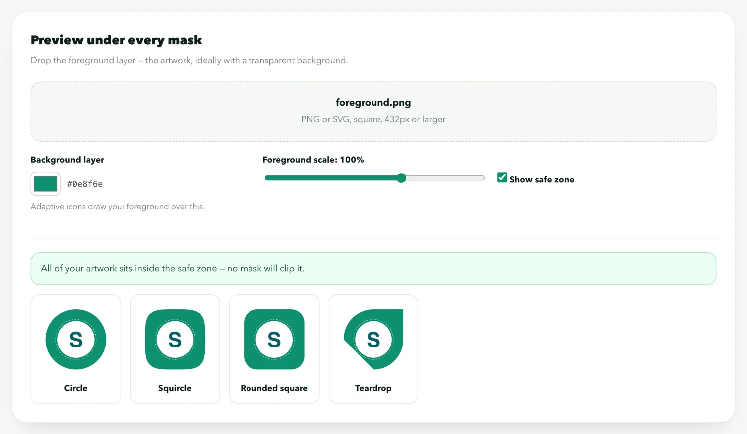
Since Android 8, launchers draw icons as an adaptive icon: a 108×108 dp foreground over a background, masked to whatever shape the phone maker chose — a circle on Pixel, a squircle on Samsung, a rounded square elsewhere. Only the central 66 dp circle is guaranteed to be visible; everything outside it can be cropped by the mask. A logo that fills the square to its corners loses its corners on every phone.
Design the foreground so the logo sits within the middle 60% of the canvas, and give the background a solid colour that looks right in any shape. The previewer shows your icon under each common mask so you can see what gets cut:
Designing for 48 pixels
Your website logo was designed for a header at 200 pixels wide with a wordmark beside it. At 48 pixels on a budget phone, that wordmark is an unreadable smear and the mark itself is a few dozen pixels. What works at that size:
- One shape. The symbol from your logo, not the symbol plus the name. If your logo is only a wordmark, use the first letter.
- Strong contrast. A light mark on a saturated background, or the reverse. Mid-tones on mid-tones vanish.
- No thin lines. Anything under about 4% of the canvas width disappears at mdpi.
- No text. The app name is shown under the icon by the launcher already.
Test by shrinking your candidate to 48 pixels and looking at it from arm's length. If you cannot tell what it is, neither can anyone else.
The Play Store icon is different
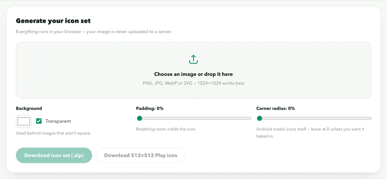
The 512×512 listing icon is not an adaptive icon. It is a flat, full-bleed PNG with no transparency that Play shows with its own rounded corners. Do not add your own rounding or a drop shadow — Play applies both and the result is a rounded rectangle inside a rounded rectangle. The icon generator exports this one alongside the launcher set.
Matching the website
People find the app on their home screen by recognising the site. Keep the same colour and the same symbol as your favicon and header; the app icon and the site's favicon should be recognisably the same thing at different sizes. If you are making both from scratch, generate the favicon set from the same source:
Common mistakes
- A rectangular logo forced into a square, distorted
- Transparent background on the launcher icon — it becomes whatever colour the launcher paints behind it
- A screenshot or photo as the icon
- Text that is readable at 512 pixels and gone at 48
- Reusing the Play Store 512 with baked-in rounding as the adaptive foreground, which then gets rounded again